For years, a subtle unease has settled over Apple’s software. It’s a shift away from intuitive functionality and towards flashy aesthetics – a prioritization of *how things look* over *how they work*. Now, with Alan Dye, the company’s design chief, departing for Meta, a wave of anticipation is building. Could this be the turning point?
Dye’s influence as Vice President of Human Interface Design was immense, shaping the entire software ecosystem. While not solely responsible for the current trajectory, the design philosophy ultimately flowed from his leadership. His departure sparks hope for a return to the design principles that once defined Apple’s brilliance, a legacy many feel has been fading.
The complaint isn’t new. Longtime Apple users have sensed a departure from the core values that made their devices so compelling. The phrase “what would Steve Jobs do?” has become a knowing meme, a lament for a lost focus on seamless usability. Yet, Apple still creates designs that are instantly recognizable and widely imitated – a testament to its lingering design prowess.
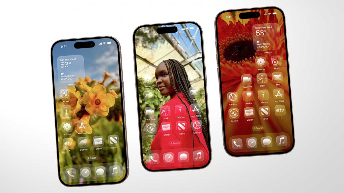
Consider the Dynamic Island. It’s visually striking, undeniably. But does it fundamentally *improve* the iPhone experience, or is it simply a more polished replacement for the previous notch? The same question arises with the recent clear app icons in iOS. While visually distinct, they sacrifice instant recognition – the very purpose of an icon – for a fleeting aesthetic appeal.
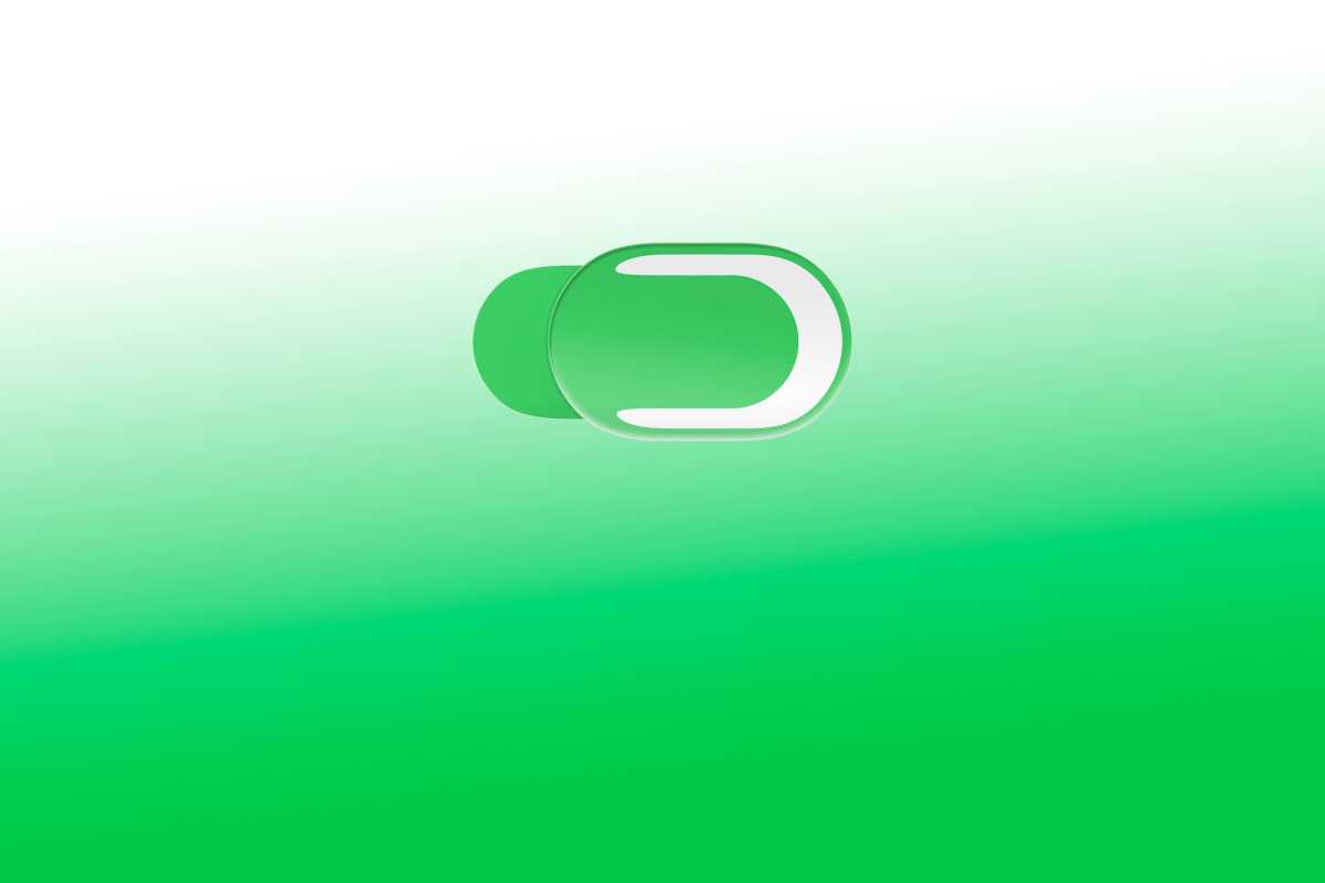
The most glaring example, perhaps, is the animated toggle switch in the latest iOS. A toggle’s function is immediate and ephemeral: on or off. Yet, Apple’s version leaps and slows, drawing unnecessary attention to itself. It transforms a simple control into a distracting spectacle, prioritizing visual flourish over practical efficiency. This isn’t design as problem-solving; it’s design as self-expression.
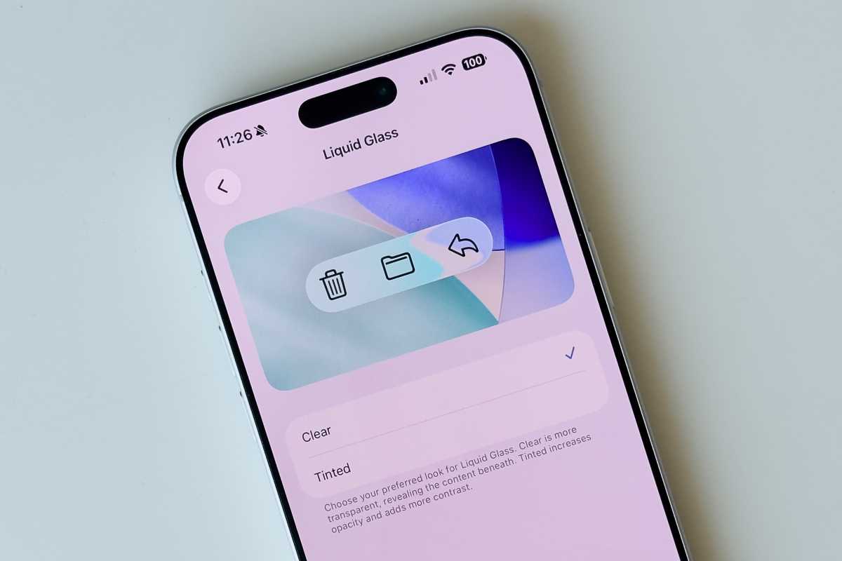
This disconnect highlights a fundamental difference in philosophy. Steve Jobs believed design wasn’t merely about aesthetics. He famously said, “Design is how it works.” It’s a principle that seems to have been lost in recent years, replaced by a “let’s do it because we can” mentality. The Liquid Glass interface, heavily promoted for its emotional impact, exemplifies this shift.
Dye’s presentation of Liquid Glass at a recent developer conference focused heavily on the *feeling* it would evoke – joy, delight. He offered little explanation of its functional improvements. The impression was clear: a visual overhaul driven by internal desire rather than a genuine need to enhance the user experience. This sparked concern among veteran Apple observers.
The reality of Liquid Glass has only amplified those concerns. Overlapping text, illegible interfaces, and excessive animations create a frustrating experience. It’s a stark reminder of what happens when Apple forgets that design should serve function, not the other way around. The interface feels less intuitive, less…Apple.
These aren’t trivial matters. The details matter. The way a device *feels* to use, day after day, impacts our lives. If products prioritize style over substance, users will inevitably seek alternatives. The quality of the user experience is paramount.
Dye’s background in fashion and advertising, while impressive in those fields, seemed an unusual fit for leading Apple’s human interface team. His successor, Stephen Lemay, represents a different approach. A long-time Apple veteran, he’s deeply rooted in the company’s culture and possesses a strong understanding of software design principles.
The news of Lemay’s appointment has been met with enthusiasm within Apple’s design community. He’s described as a “deeply respected talent” with an unwavering “attention to detail and craftsmanship” – qualities that have been noticeably absent. This change signals a potential return to the core values that once defined Apple’s software.
The shift won’t be immediate. Apple is a large organization, and Liquid Glass represents a significant investment. But with a leader grounded in solid design principles, there’s a genuine opportunity to course-correct. To rediscover the balance between beauty and usability, between aesthetics and function.
The hope is that this new direction will prioritize user experience, obsess over small details, and reignite a passion for intuitive interfaces. A return to the foundational ideas that propelled Apple’s products to the forefront of software design. And, perhaps, a swift end to the distracting animation of the Liquid Glass toggle.